Distance Learning Brings Work Up-Close
Commentary by: Nick Lum, Founder of BeeLine Reader

If you’ve ever been to an eye doctor, you’ve probably heard the mantra: every 20 minutes, you should spend 20 seconds looking at something 20 feet away. This advice is meant to help office workers combat visual fatigue or eyestrain that can set in if you spend all day doing ‘close work,’ like reading on a computer screen.
These days, it’s not just office workers who are experiencing and overdose of close work. In normal times, students switch between various focal distances (watching a teacher give a lecture, doing close work, working in groups, and socializing with friends). In the world of distance learning, all of these activities are now mediated by a screen—which means that students are spending far more time staring at a single plane that is just a foot or two in front of their faces. Not surprisingly, this lack of focal diversity is adversely affecting students and making it harder for them to do their work.
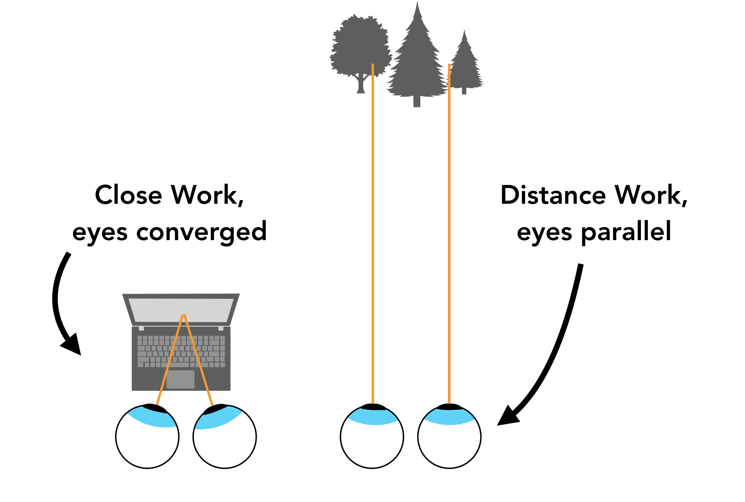
Close work can be especially taxing because it requires bringing your eyes together (‘converging’) and forming a triangular shape, as shown below. By comparison, looking into the distance allows you to relax your eyes into a parallel position, which is easier and more comfortable.
Reading is even more taxing than merely looking at fixed spot up close because reading involves constantly shifting the angles of your visual triangle and keeping your eyes perfectly ‘converged.

While it is certainly unfortunate that so many students are impacted by these challenges, the one upside is that they bring greater awareness to the need to make reading on screen less burdensome for students. Students with dyslexia, ADHD, or visual impairments know the challenges of reading on screen all too well, but their needs are not always accommodated.
Now that all students are facing difficulties with reading on screen for extended periods, schools and colleges are doing more to reduce the burden. This demonstrates the power of universal design, which can help all learners!
The Center for Applied Special Technologies has put together a demo of various techniques that can make reading on screen easier for all types of students, by allowing the reader to configure:
- text size
- line spacing
- character spacing
- page background color/contrast
- serif/sans font
- visual aids such as line-wrapping color gradients, which improve visual tracking (disclosure: I’m the founder of the organization that popularized this technique)
Other ideas for helping students include:
- avoid scanned PDFs wherever possible, as students cannot use read-aloud tools to give their eyes a break. (To convert scanned PDFs into Word docs or other readable formats, try SensusAccess’ excellent converter)
- direct students to browser plugins like Wikiwand (a Wikipedia skin with user-configurable text formatting), HelperBird (text formatting plugin) or BeeLine Reader (line-wrapping color gradients, as mentioned above). These will help students with their online reading tasks
- encourage students to use text-to-speech tools, often included for free with devices
- remind students of the 20/20/20 rule that optometrists recommend to office workers


